Anatomy of a Banner: Yours for the Taking
Welcome to the newest installment of Anatomy of a Banner, which is technically Anatomy of a Magazine Cover.
Let me begin by saying if you’re not reading Yours for the Taking by my fic luff, IngenueFic, well… why the hell not? This is Dancerward at his finest, people! He is sexy and intimidating and sexy and HE DANCES AND HE’S A BOY. A danseur. A ballerino. I, myself, am a dancer, albeit recreationally, but I appreciate a good male dancer when I see one. Or in this case, read about it in fic.
Anyway, I digress.
IngenueFic came to me requesting a magazine cover to coincide with one of her chapters. I won’t go into specifics of exactly when this occurred *cough*August 14, 2011*cough* but it was sometime last year. These were her requests:
- Dance Magazine dated December 2004
- Rob’s face, preferably clean shaven (ha! only when he has yellow eyeballs)
- on one of the following photos
This is what I love about IngenueFic. She doesn’t mess around when she asks me to make her stuff. She sent me multiple large photos of Roberto Bolle, links to Dance Magazine covers, headlines and accompanying text, etc.
Here are the photos she sent me:
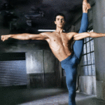


I love, love, LOVE the third one, but because magazines are portrait, it wasn’t going to work out. I couldn’t take picture two with the tights seriously, so that one was out. I tried doing manips on both the first and fourth photos, but I couldn’t find a photo of Rob that was at the correct angle, clean shaven, all hair in the frame (what can I say, boy’s got wild locks), and high enough quality to work with. That left me with the fifth picture.
The first thing I did was find a black and white photo of Rob with his head turned to the side. He’s not exactly clean shaven, but he’s not grizzly either. And the photo wasn’t super serious ballet, so I figured it was acceptable.
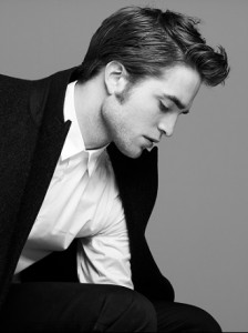
I cut out Robert’s head and superimposed it over Roberto’s. Even though Robs’ heads were pointing the same direction in the photos, it didn’t work out when I put them together. Probably because the angle of their bodies were different. I resized Rob’s head and changed the angle until it didn’t look terrible.
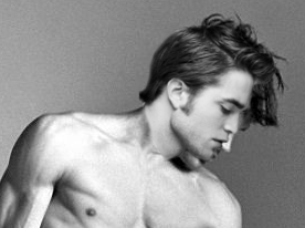
From there I deleted Roberto’s head and (some of his) hair before filling in the background and some of his shoulder and chest where his chin had been covering. Which was kind of a bitch if I may add.
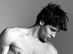
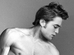
Once I had the cover image down, I looked at up bunch of old magazine covers to get a feel for the layout, style, text, etc., and of course to steal the logo. You can view the covers here.
After I figured out the fonts (which I forgot to make note of and don’t remember because it was over 8 months ago) and color scheme, I slapped it all together and this is what it looks like (click image to enlarge):
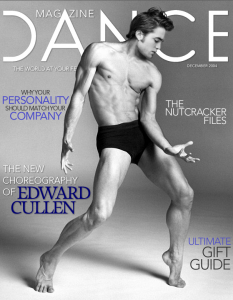
Well, what do you think? Not too shabby, eh?
**UPDATE** I wrote this post a week or two ago, because I knew IngenueFic was getting ready to post this specific chapter. Shortly after, she came to me and said the year on the magazine was wrong and needed to be 2005. This is why I always save my GIMP projects with the separate layers in tact! Finally, my analness has paid off. Of course, this was before I started making a note of things like which fonts I used. It was Avenir, for those interested. ****
Now, if you are already reading Yours for the Taking, you’ll want to read this chapter on Ficarious because, if you haven’t guessed, it’s the magazine article and there are photos and what not.
http://www.ficarious.com/twilight-chaptered-fic/yours-for-the-taking/fire/
Check out Yours for the Taking as well as IngenueFic’s other stories if you haven’t already!
Links:
Yours for the Taking on fanfiction.net
IngenueFic on fanfiction.net
IngenueFic’s website
@LaVampIngenue on Twitter
Comments (0)