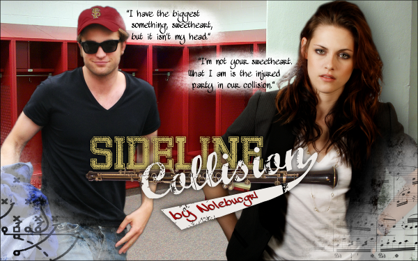
{graphics} Anatomy of a Banner
So what feels like months ago (and probably was), IngenueFic twisted my arm into making a banner for Sideline Collision by Nolebucgrl. SC is a very cute (and hot) one-shot that is currently being expanded. It features Edward, star football player of the Florida State University Seminoles, and Bella, oboe player in the marching band. Add in some cockiness, snark, and hot locker room sex and you have a recipe for an awesome story.
Now, because I love making banners but hate coming up with ideas, IngenueFic was kind enough to track down some photos. When working with people, especially when cutting them out from a background or doing any kind of manip, the bigger, the better. She found these character-fitting pictures of Rob and Kristen: (click to view the full (resized) image)


The first step was to make Rob into Edward, and about the only way I could think of to do that was to turn the blue NY hat into a maroon FS hat. Using the GIMP, I created a new layer, zoomed to about 400%, and colored the hat bright red. I then made the layer an overlay, decreased the opacity to about 60%, and fiddled with different reds until I got the desired color.
In order to erase the old logo, I used the clone tool, then went over the area with the healing tool to even out irregularities. I’m not very good at using either of these, but the fabric on the hat was very forgiving. Also, it didn’t need to be perfect because I was covering most it up anyway.
For the logo, I found a hat, cut out the SF, then scaled it and messed with the perspective until it looked like it belonged on the new hat. I added a bit of a shadow to make the embroidery appear raised. It looks kind of sketch in the HQ version of the photo, but once it’s shrunken down I think it looks okay.


Next, I cut out Rob and Kristen from their backgrounds. It was a bitch, but I’ve had bitchier. Kristen’s hair gave me some issues, which is strange because it’s usually Rob’s hair that’s impossible to cut around (thank you, hat!). I ended up lopping off a big chunk. *shrugs*
For the background, I ended up using red lockers. I figured it was fitting. You know, locker room sex and all. Also, it typically irks me when people are different sizes in banners, but I feel like it works here, almost as if he’s coming out and she’s waiting by the wall. Pissed off and wanting $30 for her broken reed.

Of course up to this point there’s a lot of stuff I didn’t go into great detail about, like fine tuning the cutouts and applying blurred overlays to soften the images. I don’t know exactly how much time I put into it, but it was probably a good couple of hours.
The text and corner pieces were probably the quickest to do once I figured out what the heck I wanted. My biggest problem (aka time waster) was trying to force what was in my head when it wasn’t the best option. I was trying to do the title around an image of an oboe and some music notes, and it kept looking like crap. I ended up scrapping the whole idea and finding some new fonts (Bandung Hardcore and Marcelle). Funny thing about the title was that, after I was finished, I activated the old oboe layer originally worked with, and it actually looked pretty good right where it was, so I left it.
The corners (which I actually did between giving up on the original title but before the new one) were fun. I used a grunge brush to fill in the corners with white, mainly because I wanted to cover up the blue jacket. I added the sheet music to Bella’s side first, then I stared at it for a while trying to figure out what to put on Edward’s side. I contemplated a helmet or the arrowhead, but I didn’t feel like they would fit with everything else. I asked myself, “what is black and white that represents Edward?” Then the little light bulb came on and I found a football play.

I wasn’t quite happy with it after that because there was too much unused space on the top half of the banner. I’d never used quotes before, but I figured now might be a good time. I poured over the one-shot a few times looking for the perfect quotes to use. There isn’t too much conversation in it iykwim. The two I used didn’t go together, actually I think Bella’s came first, but they flowed well enough. I even got to white out the background like I originally wanted to do with the title. WIN/WIN. I used Mawns Handwriting for both the quotes and Nolebucgrl’s name.
Because the photos I used were so large, I actually made the banner 1200 x 750. Working with a large image was a first for me, but I really enjoyed it. It made things a lot easier. When I was finished, I added a border and shrunk it to 600 x 375. This is the final result: (again, click to make it big)
If you haven’t read Sideline Collision, I highly recommend you do! There are currently two chapters, and I can’t wait to see where the story goes.
Mary May 20, 2011 at 11:12 am
I loved reading how you did everything. I’m a sucker for tutorials. hahaha.
ooza May 20, 2011 at 11:14 am
Maybe I will go all crazy next time with screen shots and what not!